After owning and operating New Life Hair for over 15 years I realized it was time to refresh my website and logo. I contacted my graphic designer, Mark Alano, who has always been there for me with his outstanding design ideas & service. Neither of us had a strong direction so he just began sending me ideas, but none were hitting home. I couldn’t even say what they were missing. After a couple of weeks of rumination, I went searching for inspiration online. It was late, the house was dead quiet and I began scrolling through some leaf graphics. It’s always hard to verbalize an emotion but I realize now, that’s what I was searching for. Losing one’s hair and then regaining it in the form of our vacuum hairpiece puts one through a world of emotions! We go from desperation to jubilation all the while evolving our acceptance and understanding of what living with Alopecia means.
My original logo utilized a leaf graphic. At first I thought that design would bite the dust in favor of a more hip, modern logo. Try as we might, nothing was working. The designs while attractive lacked the emotions I wanted to convey. During my online search, I landed upon a graphic of a leaf montage – not unlike the forest preserve path I had just walked through earlier in the day. But the leaves looked like they were hand drawn in pencil with beautiful detailing. Something here grabbed me! The more I studied the form of a particular leaf, the more I began to realize that the simple leaf motif was symbolic of everything I have been building my business around. Rather than ditch the leaf motif, I would evolve it.
The leaf is a perfect example of nature’s life cycle: tree buds swell in the spring until they burst open and unfurl a lush canopy of green. As if by the sweep of a magic wand, wildly colorful fall leaves dance around us in the wind until it is time for them to assume their final duty of enriching the earth. A leaf evolves through the seasons adapting to the changing conditions. If it were human, a leaf would be self-realized because it has perfectly fulfilled its life potential. And this is exactly what we all hope to achieve!
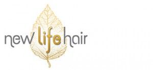
In my new graphic design, the words “new” and “hair” are in an earthy grey and they serve as parentheses to the all-important center word “life” whose gold foil conveys the magic of the sun and the life-giving energy it endows. So, as much as I hope my new logo is visually pleasing to you, I’d also like to suggest you look at it as a symbol of our own personal evolution and finally, our self-realization.

